Tootle Rebranding
Tootle is Nepal's own ride-sharing service, built around safety, security, and convenience. The brand stands for something bigger: giving people the "Freedom of Mobility." Their vision is to build a community of change-makers who believe that being able to move freely is a basic part of everyday freedom.
- Role
- UI/UX Designer
- Duration
- 1 Year
- Year
- 2022
- Client
- Tootle
The Challenge
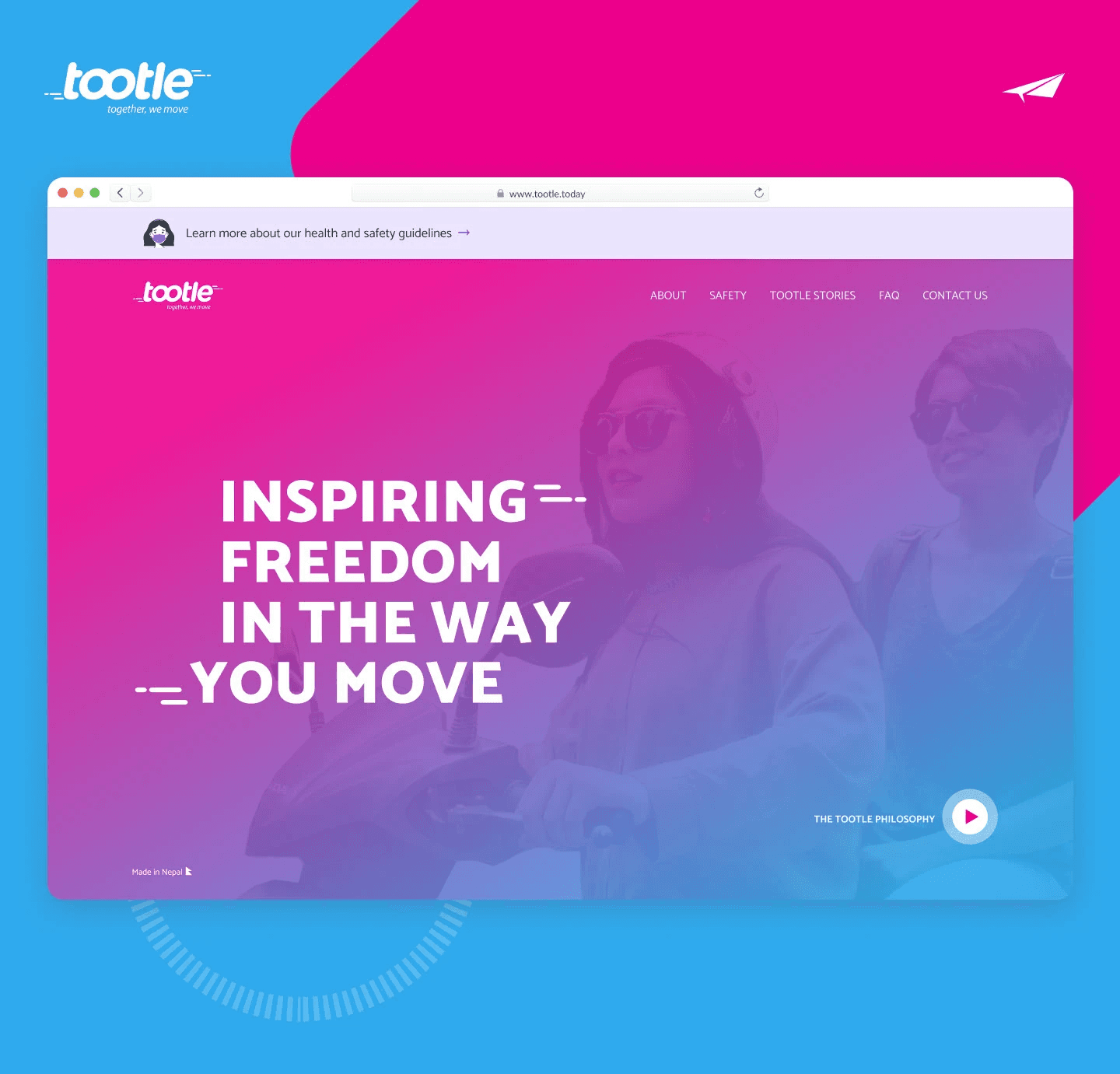
Tootle wanted a brand identity that felt bold, youthful, and full of energy — one that truly reflected their belief in freedom of movement. The existing website followed a very traditional, boxed-in layout, which didn't match the spirit of the brand at all. We needed to break away from that rigid structure and create something more expressive and alive. At the same time, the mobile app needed a complete refresh — a modern look, a smoother user experience, and an interface that felt effortless to use. This was especially important because Tootle's riders come from a wide range of age groups, from tech-savvy young adults to older users who may be less familiar with apps. So the design had to strike a balance: exciting and modern, yet simple and accessible enough for everyone to use with ease.
My Approach
To bring the "Freedom of Mobility" philosophy to life, we started with the design system itself, introducing a bold and vibrant color palette that gave the brand instant energy and personality. This color language became the foundation for everything that followed. On the website, we moved away from the old, boxed-in layout and embraced generous white space, letting the design breathe and feel more open and modern. We added subtle animations to bring the pages to life and make the experience feel more dynamic, along with custom illustrations that gave Tootle a distinct, friendly personality rather than relying on generic stock imagery. Throughout the process, we made sure the website and mobile app felt like one unified brand. Instead of designing them separately, we kept the same visual language, colors, and overall feel consistent across both platforms, so that whether someone was browsing the website or booking a ride on the app, the experience felt familiar and connected.
The Outcome
The result was a refreshed Tootle brand that felt modern, bold, and colorful across both the website and the mobile app. The rigid, traditional layout gave way to an open, breathable design that better expressed the brand's energetic spirit. Riders now experience a consistent look and feel whether they're on the web or on the app, one that's approachable enough for a diverse audience while still standing out as fresh and youthful — bringing Tootle's philosophy of freedom of mobility to life in every screen.